
Two ice cream brands, one multimillion-dollar lawsuit, and a pretty important lesson about why building a recognizable brand starts long before you choose your colors and fonts.
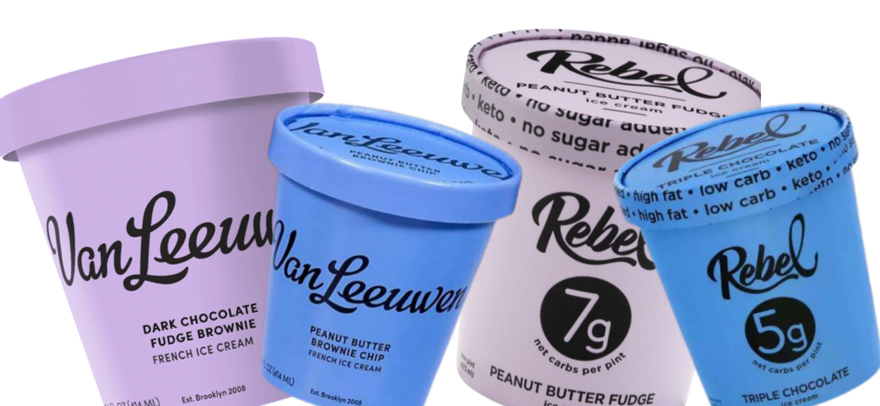
Okay, so apparently there's been some serious drama in the ice cream aisle. And as someone who spends an arguably unreasonable amount of time thinking about branding (and ice cream), I find this one particularly fascinating.
If you've ever wandered down the frozen dessert aisle at Whole Foods, there's a good chance you've seen Van Leeuwen ice cream. You know the one. Pretty pastel pints, simple black lettering, and that effortlessly cool, slightly nostalgic aesthetic that makes a $9 pint of ice cream feel like a perfectly reasonable purchase.
Well, another ice cream brand called Rebel found itself in some pretty hot water over packaging that looked a little too familiar.
In July 2026, a federal judge ordered Rebel to pay nearly $23.8 million in a trade dress infringement case brought by Van Leeuwen. The dispute centered on the overall appearance of Rebel's packaging and whether it was too similar to the recognizable identity Van Leeuwen had spent years building.
Yep. Almost $24 million. Over ice cream packaging.
Now, there's a whole legal conversation to be had about intellectual property, trade dress, and how much of a particular design a company can actually protect. And the judgment was appealed, so this isn't a story I'm going to pretend has a perfectly neat ending.
But what I find most interesting isn't really the lawsuit itself.
It's the branding lesson underneath it.
Because this is a pretty incredible example of what happens when a business builds a recognizable identity through intentional brand strategy, and what can happen when another business gets a little too close to someone else's creative direction.
And while most of us aren't operating multimillion-dollar ice cream companies, the lesson is just as relevant for the coach designing her first website, the creative entrepreneur refreshing her visual identity, or the service provider trying to stand out in an increasingly crowded industry.
The goal of branding isn't to look like a successful business. It's to build a brand that's successful because it's unmistakably yours.
First, let's talk about why Van Leeuwen's branding works so well.
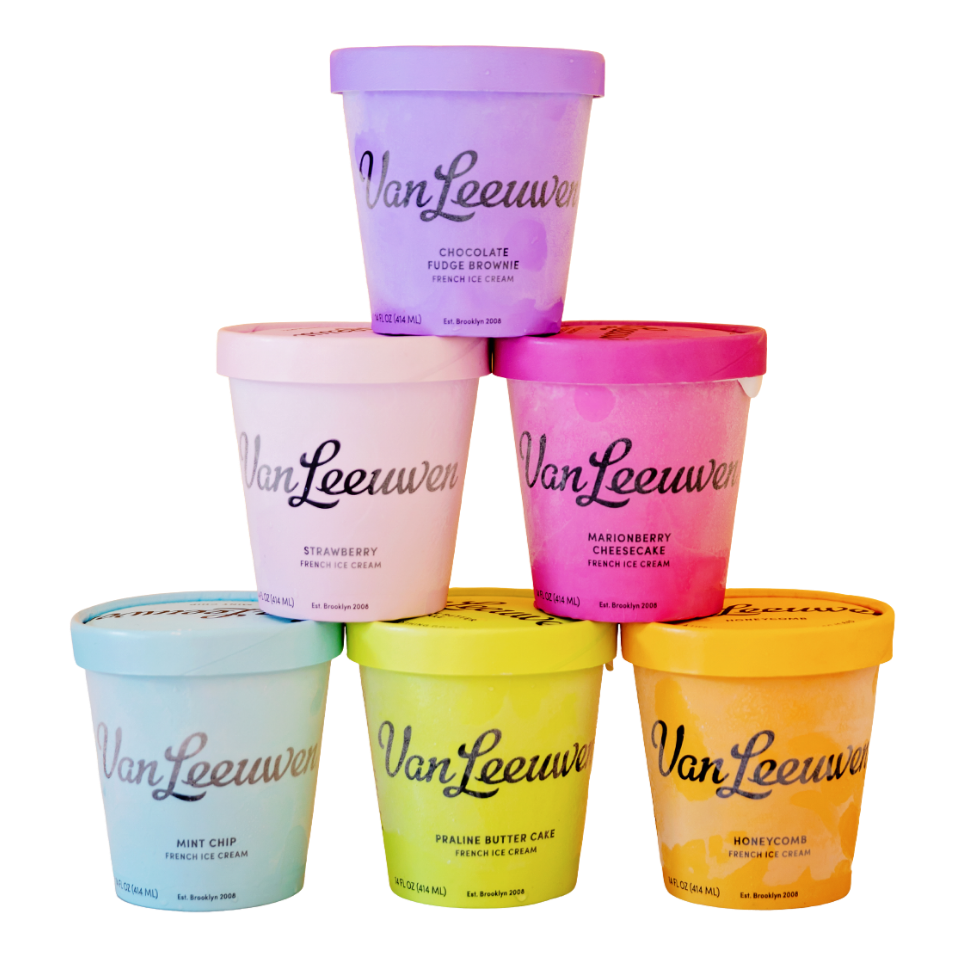
Van Leeuwen didn't invent pastel colors. They didn't invent handwritten lettering, minimalist packaging, or the idea of making an everyday product feel a little more luxurious.
None of those individual design choices is particularly revolutionary.
But the way they brought those elements together? That's where the magic happened.
When Van Leeuwen partnered with design agency Pentagram to refresh its packaging in 2016, the company was looking for more than a prettier ice cream container.
It needed a visual identity that could stand out on crowded grocery store shelves, communicate the quality of its product, and create a consistent, recognizable experience across its growing collection of flavors.
And the resulting design did exactly that.
The colorful pints are playful without feeling childish. The typography has personality without being difficult to read. The overall design feels simple, confident, and premium without relying on the predictable visual cues we often associate with luxury products.
It's a little quirky. A little nostalgic. And somehow both approachable and elevated.
Most importantly, it feels like Van Leeuwen.
According to Pentagram's case study, retail sales increased by 50% following the redesign. Now, that doesn't mean we can attribute every dollar of that growth to the packaging alone. There are plenty of factors that influence sales.
But it's a pretty compelling example of how thoughtful design can support a business's larger goals.
And here's the thing I really want you to understand:
The design wasn't successful simply because it was beautiful. It was successful because it was doing a job.
It was helping people recognize the product, understand its positioning, and form an impression of the brand before ever tasting the ice cream.
That's what strategic brand design is supposed to do.
Now, let's talk about Rebel.
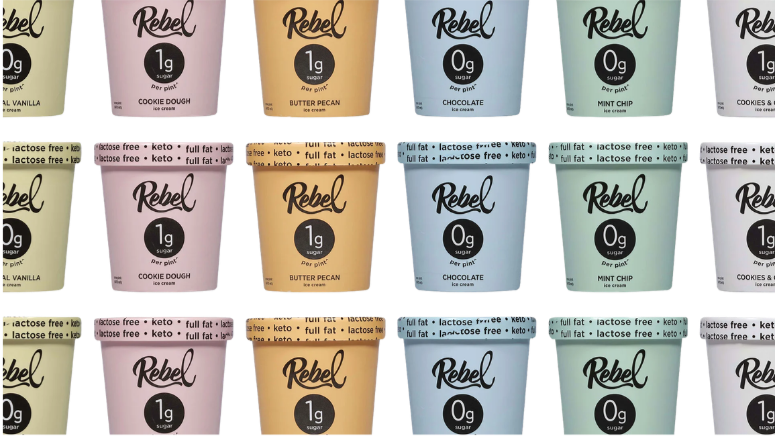
What's interesting about Rebel is that it actually had a pretty clear opportunity to differentiate itself.
Van Leeuwen positions itself around premium ingredients, indulgence, and a modern take on traditional ice cream.
Rebel, on the other hand, built its business around low-carb, keto-friendly ice cream.
Those are two different value propositions.
Sure, they're both selling frozen desserts. And yes, there's probably some overlap between the people who buy them.
But their customers aren't necessarily choosing those products for the same reasons.
Someone reaching for Van Leeuwen might be looking for a delicious little indulgence. Someone reaching for Rebel might be looking for a dessert that fits their dietary preferences without feeling like they're sacrificing something they love.
Both are valid reasons to buy ice cream. Both create opportunities for compelling messaging and creative direction.
And that's exactly what makes this case so interesting from a brand strategy perspective.
Rebel had something distinctive to build on. It didn't need to borrow the visual language of another successful ice cream company to communicate its own value.
Yet the packaging became similar enough to Van Leeuwen's that a federal court found it infringed Van Leeuwen's protected trade dress.
And while a legal finding of infringement isn't the same thing as proving what was going through someone's mind during the design process, the comparison raises an important question for anyone building a brand:
Are you making creative decisions because they support your business, or because you've seen those decisions work for someone else?
Because those are two very different approaches to branding.
Your Pinterest board is not a brand strategy.
Listen, I love a good mood board.
I'm a designer. I can spend an embarrassing amount of time looking at beautiful typography, color combinations, packaging, photography, and website layouts.
And I genuinely believe collecting visual inspiration is an important part of the creative process.
But there's a reason brand strategy comes before visual design in my process.
When you start with inspiration instead of strategy, it's incredibly easy to confuse what you like with what your business actually needs.
Maybe you love the minimal, neutral aesthetic of a luxury skincare brand. Or you're drawn to the bold, playful colors of a trendy creative studio. Maybe every business you follow on Instagram seems to be using the same oversized serif font, so you start wondering if yours should too.
And before you know it, you've created an entire visual identity based on a collection of things that look really good together.
But do they actually communicate anything meaningful about your business?
Do they reflect your personality and values? Do they resonate with the people you're trying to reach? Do they help someone understand why your business is different from the other ten options they're considering?
Or do they just look like the brands you've been admiring lately?
There's nothing inherently wrong with loving someone else's aesthetic. But liking the way something looks isn't the same as understanding why it works.
And that's the distinction that matters.
A mood board can help you explore how your brand might look and feel. But it can't tell you what your business stands for, who you're trying to connect with, or what makes your offer worth choosing.
Those answers have to come first.
Inspiration and imitation are not the same thing.
I want to be really clear about something here because I think this is where a lot of business owners get unnecessarily intimidated by the branding process.
You don't need to invent an entirely new design style to create an original brand.
Seriously. There are only so many colors, fonts, layouts, and visual trends to work with. And every designer, artist, and creative professional draws inspiration from things they've seen before.
Originality doesn't mean creating something that has never existed in any form.
It means making intentional choices that come together to express something distinctively yours.
Let's go back to Van Leeuwen for a second.
Pastel colors aren't unique. Script lettering isn't unique. Minimalist packaging isn't unique.
But together, those choices create an overall impression that customers have come to associate with one particular brand.
That's the power of consistency and recognition.
Now imagine you're building a wellness coaching business and you absolutely love the branding of a successful competitor.
You could look at their website, fall in love with the earthy color palette and elegant typography, and decide to create something similar.
Or you could ask yourself why their brand works so well.
Maybe the muted colors create a sense of calm and stability. Maybe the typography communicates sophistication and trust. Maybe the photography makes their services feel personal and approachable.
Those are useful observations!
But instead of copying the creative execution, you can take what you've learned about the relationship between design and perception and apply it to your own business.
Maybe your coaching approach is actually more energetic and encouraging than calming. Maybe your clients aren't looking for a serene retreat from their lives; they're looking for someone who's going to help them make bold changes.
Suddenly, the same visual direction you loved for someone else's business might not be the best choice for yours.
And THAT is where strategy becomes so valuable.
It helps you move beyond asking, "Do I like this?" and start asking, "Is this right for my brand?"
A beautiful brand and a strategic brand are not necessarily the same thing.
This is probably one of the biggest misconceptions I see among small business owners.
We tend to think of branding as the visual stuff. The logo, colors, fonts, photography, website design, and all the other elements that make a business look professional.
And yes, those things matter. A lot.
But they're only one part of a much bigger picture.
Your brand is the impression people form about your business through every interaction they have with it.
It's what they understand about you, what they expect from you, how they feel when they encounter your business, and what they remember afterward.
Your visual identity helps communicate that impression, but it doesn't create the entire thing on its own.
That's why I always encourage business owners to get clear on their brand foundations before investing a bunch of time or money into design.
You need to understand who you're serving and what matters to them. You need to know what makes your approach different, what you want people to associate with your business, and how you want them to feel when they interact with your brand.
And perhaps most importantly, you need to understand the connection between those things.
Because your brand isn't a collection of independent creative decisions.
It's a system.
Your messaging should reinforce your positioning. Your visual identity should reflect your personality. Your website should communicate your value. Your marketing should create a consistent experience that helps the right people recognize that you're the right fit for them.
When those things work together, you start building something much more valuable than a pretty Instagram feed.
You start building recognition, connection, and trust.
And the more consistently you communicate who you are and what makes you different, the easier it becomes for people to remember you.
But what if you're just starting out?
Here's where I think this conversation becomes especially important for entrepreneurs and small business owners.
You might be thinking, "Okay, but Van Leeuwen is a major ice cream company. I'm literally just trying to get my business off the ground. Do I really need to think about all of this?"
And my answer is yes.
But probably not in the way you're imagining.
You don't need an expensive agency, a six-month branding process, or a perfectly polished visual identity before you can start showing up and selling your services.
You absolutely can DIY your brand. In fact, I'm a big believer that business owners should understand how to make thoughtful branding decisions for themselves, whether they eventually hire a designer or not.
What you do need is clarity.
You need to understand what you're building and why someone should care about it.
And honestly, the earlier you start thinking about those things, the better.
Because when you skip that foundational work, you often end up making decisions based on whatever feels right in the moment.
You choose a logo because you like it. Then you see a competitor's website and decide you want something more sophisticated. Then your business evolves a little, and suddenly your messaging doesn't fit anymore. Then you discover a new design trend and start questioning your entire visual identity.
Sound familiar?
Before you know it, you're on your third rebrand in two years and wondering why nothing ever feels quite right.
I've seen it happen so many times. And usually, the problem isn't that the business owner has terrible taste or can't make design decisions.
It's that they're trying to use design to answer questions that strategy should have answered first.
And no amount of scrolling Pinterest is going to fix that.
So, how do you actually build a brand that's unmistakably yours?
Before you start collecting inspiration or opening Canva, I want you to think about something.
If someone removed your logo and business name from your website, would there still be anything about the experience that felt distinctly yours?
Would your messaging sound like you? Would your personality come through? Would someone understand what makes your approach different?
Or could you swap in a competitor's name without changing much of anything?
That's a really useful exercise because it forces you to look beyond the surface-level elements of your brand.
Start by thinking about what makes your business different. Not just what you sell, but how you approach your work, what you believe, what you prioritize, and why the people you serve might choose you over someone offering something similar.
Then think about your audience. What are they actually looking for when they come to you? What do they value? What assumptions might they already have about your industry, and how do you want to challenge or reinforce those perceptions?
And finally, think about the impression you want to create.
Do you want people to experience your brand as warm and encouraging? Bold and innovative? Thoughtful and sophisticated? Playful and approachable?
There's no universally correct answer. The right direction depends on your business and the people you're trying to connect with.
Once you understand those things, your design decisions become so much easier to make.
You're no longer choosing colors just because they're pretty. You're choosing them because they help communicate a particular feeling.
You're not selecting fonts simply because they're popular. You're considering how their personality reinforces the message you want to send.
And you're not trying to recreate someone else's successful brand. You're building a visual identity that supports your own positioning.
That's what I mean when I talk about intentional branding.
It's not about making every decision more complicated.
It's about giving yourself a clear foundation so those decisions become simpler.
The real lesson from the ice cream aisle
I think it's pretty incredible that something as seemingly ordinary as an ice cream container can become such a valuable and recognizable part of a business.
But that's exactly what happens when branding is done well.
Over time, the decisions you make about how your business looks, sounds, and shows up begin to create associations in people's minds.
They start recognizing your work. They become familiar with your personality. They develop expectations about the experience you provide.
And eventually, your brand can become something people actively look for, remember, and recommend.
That's a pretty big deal.
The Van Leeuwen and Rebel dispute is an unusually expensive reminder that a distinctive brand identity has real business value. But I think the more useful lesson for most of us is that building a recognizable brand requires more than borrowing the visual cues of businesses we admire.
It requires understanding what makes our own business worth remembering.
And that's something you can start doing whether you're working with a professional designer, DIYing your visual identity in Canva, or still figuring out what you want your business to become.
You don't need to be the next Van Leeuwen.
You need to be the first, and only, YOU.
And that starts with strategy.
Ready to build a brand that actually feels like yours?
If you've been collecting inspiration, second-guessing your design decisions, or struggling to figure out what makes your business different, I created the Brand Clarity Blueprint to help you start connecting those dots.
It's a free resource designed to help you get clearer on the foundations of your brand so you can make more intentional decisions about how you communicate, design, and market your business.
Because building a brand you're proud of shouldn't start with trying to look like someone else.
It should start with understanding what makes you worth choosing.